In making a visually guiding web design, carefully assembling the elements in layers using CSS proves to be a useful skill. We have developed a main technique which is to affect the amount of transparency of the background pictures. Such a move can significantly up the user interface appeal. This article touches on the reality of visual design using background image opacity in HTML and CSS extending from simple practices to more complex possibilities.
What is Background Image Opacity?
Background image opacity is a criterion in web design which refers to the opacity level of an image set for background. This gives a designer a chance to decide how much of the background is visible beneath the content on the foreground so as they can successfully apply theatrical visual effects and improve the readability of the text overlapped with the images.
How to Adjust Background Image Opacity Using CSS
Through adjusting background image opacity via CSS allows web designers to have flexible and attractive backgrounds image blended with content being displayed at the same time. There are primarily two methods to achieve this: by means using the RGBA color values and the opacity property. Let’s delve into each method in detail:
Using RGBA Color Values
This approach consists in using the RGBA background color property, based on RGBA value. RGBA is pronounced as Red, Green, Blue and Alpha channels (for transparency). With the alpha channel as a way to achieve transparency for the background image, you can precisely manage the opacity.
.background-image-opacity {
background-color: rgba(0, 0, 0, 0.5); /* Black background with 50% opacity */
background-image: url('image.jpg');
background-blend-mode: multiply;
}| CSS Property | Description |
|---|---|
| background-color | Defines the color of the background, where the fourth value (0.5 in this case) determines the opacity level. |
| background-image | Specifies the URL of the background image. |
| background-blend-mode | Specifies how the background image should blend with the background color. In this case, multiply is used to darken the image. |
Opacity Property
The opacity property adjusts the transparency of the entire element, including its background image and contents. It’s important to note that this method affects the entire element’s opacity, not just the background.
.opacity-image {
opacity: 0.5; /* 50% opacity */
}
Sets the opacity level of the element, with a value ranging from 0 to 1, where 0 is fully transparent and 1 is fully opaque.
Choosing the Right Method
The choice between these methods depends on the specific design requirements and the desired effect:
- RGBA Color Values: Ideal when you want to adjust the background image’s opacity independently of the element’s contents. It provides more control over the blending of colors and can create interesting visual effects;
- Opacity Property: Suitable for cases where you want to make the entire element, including its contents, semi-transparent. However, it may not offer the same level of control over the background image as RGBA color values.
Techniques to Achieve Adjustable Image Opacity without Affecting Content

One common issue with using the opacity property is that it affects all the element’s contents. Here are some techniques to adjust only the background image opacity without altering the content:
Pseudo-Element Method
The Pseudo-Element Method involves creating a pseudo-element, either ::before or ::after, with the same dimensions as the parent element. This pseudo-element serves as a layer specifically for the background image, allowing you to adjust its opacity independently of the content.
- Create a Pseudo-Element: Use the ::before or ::after pseudo-element to create an additional layer;
- Set Dimensions: Ensure that the pseudo-element covers the entire area of the parent element by setting its width and height to 100%;
- Apply Background Image: Set the background image for the pseudo-element;
- Adjust Opacity: Apply the desired opacity level to the pseudo-element;
- Positioning: Position the pseudo-element behind the content using CSS positioning.
.background-image-opacity::before {
content: '';
position: absolute;
top: 0;
left: 0;
width: 100%;
height: 100%;
background-image: url('your-image.jpg');
opacity: 0.5; /* 50% opacity */
z-index: -1;
}
In this example, .background-image-opacity is the parent element to which the background image and opacity effect are applied. Adjust the opacity value as needed to achieve the desired visual effect.
Separate Layer Method
The Separate Layer Method involves adding an additional HTML element specifically for the background image. This element acts as a separate layer, allowing you to control its opacity independently.
- Create a Background Layer: Insert an additional HTML element to serve as the background layer;
- Apply Opacity: Apply the desired opacity level to the background layer;
- Positioning: Position the background layer behind the content using CSS positioning.
<div class="background-layer"></div>
<div class="content">
<!-- Content goes here -->
</div>
In this example, .background-layer is the additional HTML element that serves as the background layer. Apply the opacity effect directly to this element using CSS.
Using CSS Filters for Enhanced Effects
CSS filters allow developers to manipulate the visual rendering of HTML elements, including images and backgrounds, by applying various graphical effects. These effects can alter attributes such as color, brightness, contrast, and saturation. The filter property is used to apply these effects and can accept multiple filter functions separated by spaces.
Applying Opacity Filters
One commonly used filter is the opacity filter, which adjusts the transparency of an element. This is particularly useful for creating overlay effects or fading background images. The opacity() function accepts a value between 0 (completely transparent) and 1 (fully opaque). For example:
.background-filter {
filter: opacity(50%);
}
This code snippet applies a 50% opacity filter to the .background-filter class, making the background image partially transparent.
Enhancing Visual Effects
By combining CSS filters with other properties such as background-blend-mode, developers can create visually stunning effects. For instance, applying a grayscale filter along with blending modes can create a sophisticated monochromatic effect:
.monochrome-filter {
filter: grayscale(100%);
background-blend-mode: overlay;
}
This code snippet applies a grayscale filter to the background image and sets the blend mode to overlay, resulting in a striking monochromatic effect.
Experimenting with Filter Functions
CSS filters offer a range of functions beyond opacity and grayscale. Developers can experiment with various filter functions to achieve desired visual effects. Some commonly used filter functions include:
- Blur: Applies a blur effect to the element;
- Brightness: Adjusts the brightness of the element;
- Contrast: Adjusts the contrast of the element;
- Saturate: Adjusts the saturation of the element;
- Sepia: Applies a sepia tone effect to the element.
.element {
filter: blur(5px) brightness(120%) contrast(90%) saturate(150%) sepia(30%);
}
This code snippet demonstrates the application of multiple filter functions to the .element class, resulting in a combination of blur, brightness, contrast, saturation, and sepia effects.
Considerations and Browser Compatibility
While CSS filters offer powerful visual enhancements, it’s essential to consider browser compatibility. Not all browsers support CSS filters, and some older versions may exhibit inconsistent behavior. It’s advisable to test your website across different browsers and versions to ensure a consistent user experience.
Practical Examples of CSS Background Opacity
Let’s explore how different settings affect the visual outcome. Here are a few practical examples:
Low Opacity
Low opacity backgrounds are particularly useful when you want to ensure that the content on top remains easily readable and stands out. This setting is commonly employed in scenarios where text or other elements need to be emphasized while still maintaining a background presence. Here’s a CSS example demonstrating low opacity:
.low-opacity-background {
background-color: rgba(0, 0, 0, 0.3); /* Adjust opacity value (0.1 to 1) */
/* Additional styling properties */
}
In this example, rgba() is used to specify the background color along with its opacity level. The fourth parameter (0.3 in this case) determines the opacity, where 0 is fully transparent and 1 is fully opaque.
High Opacity
High opacity backgrounds are suitable for providing subtle hints or accents without overwhelming the content. This setting allows background elements to be clearly visible while still allowing the foreground content to take precedence. Here’s a CSS example illustrating high opacity:
.high-opacity-background {
background-color: rgba(255, 255, 255, 0.8); /* Adjust opacity value (0.1 to 1) */
/* Additional styling properties */
}
Similar to the previous example, rgba() is utilized to specify the background color and opacity level. In this case, an opacity value of 0.8 is chosen, providing a strong background presence without overshadowing the content.
CSS Properties for Background Opacity

Controlling the opacity of background elements is crucial for achieving visually appealing layouts. CSS provides several properties that enable developers to adjust the transparency level of backgrounds, enhancing the overall design aesthetics and user experience. Let’s explore these properties in detail:
opacity Property
The opacity property in CSS adjusts the transparency level of an element, affecting not only the element itself but also all its children. This property accepts values between 0 and 1, where 0 indicates complete transparency (invisible) and 1 indicates full opacity (completely visible). Here’s an example of how to use the opacity property:
.element {
opacity: 0.5; /* Adjust opacity value (0 to 1) */
}
By applying the opacity property to an element, you can control its transparency without affecting its underlying content.
background-color Property
The background-color property in CSS specifies the color of an element’s background. When combined with RGBA (Red, Green, Blue, Alpha) values, this property allows developers to set the background color with a specified opacity level. The “A” in RGBA denotes the alpha channel, which determines the opacity of the color. Here’s how to use the background-color property with RGBA values:
.element {
background-color: rgba(255, 0, 0, 0.5); /* Adjust RGB values and opacity (0 to 1) */
}
In this example, the background color is set to red with an opacity of 0.5, resulting in a semi-transparent red background.
background-blend-mode Property
The background-blend-mode property in CSS determines how background images blend with background colors or other background images. It offers various blending modes, allowing developers to create unique visual effects and overlays. Here are some commonly used blend modes:
- Normal: Default blending mode where the background image is displayed as is;
- Multiply: Darkens the background by multiplying the background color with the background image;
- Screen: Lightens the background by applying the inverse of the background color to the background image;
- Overlay: Combines the Multiply and Screen blend modes, resulting in a blend that preserves the highlights and shadows of both the background color and the background image.
Here’s how to use the background-blend-mode property:
.element {
background-image: url('background.jpg');
background-color: rgba(0, 0, 255, 0.5);
background-blend-mode: multiply; /* Adjust blend mode */
}
In this example, the background image is multiplied with the blue background color, resulting in a blended effect.
Best Practices for Implementing Background Image Opacity
To ensure smooth performance and high-quality visuals:
Efficient CSS Methods
Utilize efficient CSS methods tailored to your specific needs. By employing CSS properties like opacity, rgba(), or background-color with alpha channel, you can achieve the desired transparency effect while maintaining performance. Here’s a comparison of these methods:
| CSS Method | Description |
|---|---|
| opacity | This property sets the opacity level for an element and its children. It affects the entire element, including any text or other content within. |
| rgba() | The rgba() function allows you to specify a color using red, green, blue, and alpha (transparency) values. It provides more control over the background color’s opacity. |
| background-color | Using background-color property with an alpha channel allows you to apply transparency only to the background, leaving text and other content fully opaque. |
Responsive Testing
Test your website across different devices to ensure responsiveness and compatibility. Background image opacity may behave differently on various screen sizes and resolutions. Conduct thorough testing on desktops, laptops, tablets, and mobile devices to guarantee a consistent user experience.
Optimize Loading Time
Keep your website’s loading time in check by optimizing images and CSS. Large images or excessive CSS stylesheets can significantly impact performance, leading to longer loading times and increased bounce rates. Consider the following optimization techniques:
- Image Compression: Use tools like Photoshop, ImageOptim, or TinyPNG to compress background images without sacrificing quality;
- CSS Minification: Minify CSS files to reduce their size and decrease loading times. Tools like CSS Minifier can automate this process;
- Lazy Loading: Implement lazy loading for background images to defer their loading until they’re needed, improving initial page load speed.
By implementing these optimization strategies, you can ensure that your website loads quickly and efficiently, providing a seamless user experience across different devices.
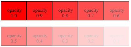
CSS Image Opacity (Transparency)
In CSS, there is no property such as transperancy. But, you can achieve transparancy by inserting a pseudo element with regular opacity the exact size of the element behind it. The CSS3 property for transparency is opacity and it is a part of the W3C CSS3 recommendation.
div
{
  opacity: 0.6;
}
The opacity-level describes the transparency-level, it ranges from 0.0 to 1.0. The level 0.0 is completely transparent, 0.5 is 50% see-through and level 1.0 is not transparent. Opacity has a default initial value of 1 (100% opaque).
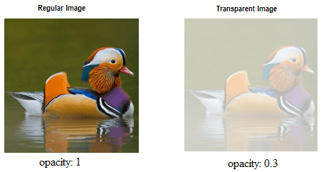
Creating a Transparent Image
You can create Transparent Background Images by using the CSS property opacity.
The first image is the opacity level 1.0 and second image we set opacity level 0.3.
Source Code
<!DOCTYPE html>
<html>
<head>
  <style>
    img {
      opacity: 0.3;
      filter: alpha(opacity=30); /* For IE 8 & 9 (more valid) */
    }
  </style>
</head>
<body>
  <img src="img/duck.png" width="192" height="191" alt="transparent image">
</body>
</html>
All modern web browsers have implemented a very basic CSS opacity property so there is no need of browser specific code. But IE8 and earlier use filter:alpha(opacity=x). The x can take a value from 0 to 100. The value 50 means 50% see-through.
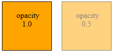
How to create a transparent color Div
You can create a tranperant background Div using the CSS Opacity property.
The first div has transperancy level of 1. and send div level 0.5.
Source Code
<!DOCTYPE html>
<html >
<head>
  <style type="text/css">
    .sq{
      width:100px;
      height:100px;
      background:orange;
      border: 1px solid black;
      float:left;
      align:center;
      opacity:1.0;
    }
    .sq1{
      width:100px;
      height:100px;
      background:orange;
      border: 1px solid black;
      float:left;
      align:center;
      opacity:0.5;
    }
  </style>
</head>
<body>
  <div class="sq">
    opacity 1.0
  </div>
  <div class="sq1" >
    opacity 0.5
  </div>
</body>
</html>
Transparent Border
In CSS you can make your image border transparent.
Source Code
<!DOCTYPE html>
<html>
<head>
  <style>
    .duck
    {
      width:190px;
      height:190px;
      background: url(img/duck.png) no-repeat;
      border:5px solid #000000;
    }
    .trBorder {
      height: 120px;
      width: 120px;
      margin: 30px;
      border: 10px solid rgba(255,255,255,.5);
    }
  </style>
</head>
<body>
  <div class="duck">
    <div class="trBorder">
    </div>
  </div>
</body>
</html>
transparent Box
The following program shows a transparent box over the image and you can write your text in the Transparent Box.
Source Code
<!DOCTYPE html>
<html>
<head>
  <style>
    .duck
    {
      width:190px;
      height:190px;
      background: url(img/duck.png) no-repeat;
      border:5px solid #000000;
      font-size: 30px;
      font-weight: 900;
      color:blue;
    }
    .trBorder {
      height: 150px;
      width: 150px;
      margin: 20px;
      background: rgba(255,255,255,.5);
    }
  </style>
</head>
<body>
  <div class="duck">
    <div class="trBorder" align=center>
    Write your text here
    </div>
  </div>
</body>
</html>
transparent Text
The following program using a tricky way to appear text as transparent.
Duck
Source Code
<!DOCTYPE html>
<html>
<head>
  <style>
    .duck
    {
      width:192px;
      height:191px;
      background: url(img/duck.png) no-repeat;
      border:5px solid #000000;
      font-size: 70px;
      color:rgba(255,255,255,.5);
      font-weight: 900;
    }
    .trBorder {
      height: 120px;
      width: 120px;
      margin: 30px;
      border: 10px solid rgba(255,255,255,.5);
    }
  </style>
</head>
<body>
  <div class="duck">
  <br>
  Duck
  </div>
</body>
</html>
Conclusion
Manipulating background image opacity in CSS can transform a simple design into a visually striking one. By understanding the various methods and techniques available, designers can effectively utilize CSS to enhance their web projects, ensuring both aesthetic appeal and functional readability.
This guide not only serves as a technical walkthrough but also sparks creativity, enabling you to implement background image opacity in CSS with confidence and style.
FAQ
No, CSS does not allow direct opacity adjustments on background images alone. Use a pseudo-element or an additional layer method.
If you use the opacity property, yes, it affects all child elements. To avoid this, use the RGBA method or separate layer techniques.
Yes, more layers can impact performance, especially on less powerful devices. Optimize by limiting the number of layers and complexity.