Introducing shadows in the picture elements to the site may greatly improve the visual attractiveness of the latter. In this article, you will discover how to cast shadows on images by manipulating their CSS. We’ll try to cover different techniques on one end and show some useful ones on the other side as well as answer some of the frequently asked questions to make adding this function super easy into your tasks.
Why Use Image Shadows?
Shadows aren’t just visual flairs; they serve practical purposes in web design:
Depth and Emphasis
In web design, invoking depth on a two-dimensional screen is a difficult yet crucial element. The use of image shadows does this by giving case clues for some elements that are raised or recessed. Here’s how shadows contribute to depth and emphasis:
- Enhancing User Focus: Through the use of shadows designers can bring focus to areas of significance, for instance, ‘call-to-action button’, or ‘featured product’;
- Increasing Aesthetic Value: Even subtle shadows in a simple design can make it extraordinary and engaging.
Illustrative Example:
| Aspect | Flat Design | Enhanced Design |
|---|---|---|
| Appearance | Image without shadow, blending into the background | Image with a shadow, creating a sense of elevation |
| Visual Effect | Static appearance | Creates an engaging focal point |
| Engagement | Minimalist, less attention-grabbing | Draws attention and adds depth to the design |
| Usability | Suitable for simple interfaces or graphics | Ideal for creating depth and highlighting specific elements |
Visual Separation
The ability to distinguish between different elements and sections within a complex web design layout is the fundamental basis for not only the correct representation of the layout but also the easy organization for the navigation of users. Image shadow CSS techniques are particularly useful in this regard:I
- Clarifying Structure: Shadows can help divide sections and people could, therefore, grasp how the arrangement of the layout looks from a single glance;
- Enhancing Usability: Correct dotting enables to decrease the visual pollution, and helps users overcome the existing divides and hence generating the better use of the site.
Practical Applications:
| Aspect | Interactive Elements | Layering Visuals |
|---|---|---|
| Purpose | Indicates functionality of interactive elements | Clarifies order and relevance of overlapping elements |
| Functionality | Suggests to users that elements are actionable | Creates a layered effect, improving visual hierarchy |
| User Experience | Enhances usability by guiding user interaction | Improves clarity and organization of website content |
| Visual Impact | Adds depth and interactivity to the design | Enhances visual appeal and understanding of website structure |
Aesthetic Appeal
The visual power of a website can be a pivotal factor that makes online users patronize and embrace it. Properly positioned shadows are known to enrich an exterior image and create a premium feel as well as modern look and feel for the surroundings.
- Polished Appearance: The dark color in the background casts a shadowing that is often perceived as more mature and credible;
- Stylistic Versatility: Different kinds of shadows can be restyled to meet different design criteria such as minimalistic to complex and can play its part in bringing out the particular theme and mood of the site.
Shadow Varieties:
| Aspect | Soft Shadows | Hard Shadows |
|---|---|---|
| Appearance | Subtle, adding depth without overpowering the design | Pronounced and dramatic, creating bold visual effects |
| Intensity | Gentle and understated | Strong and conspicuous |
| Usage | Commonly used for a softer, more refined look | Employed in creative and bold designs for a striking impact |
| Visual Effect | Enhances depth without drawing excessive attention | Creates a bold and impactful visual statement |
Basic CSS for Image Shadows
Adding shadows to images using CSS can enhance the visual appeal of your website and create depth within your design. The box-shadow property in CSS allows you to easily achieve this effect. Let’s delve into the basics of using CSS for image shadows.
Basic CSS for Image Shadows
The simplest way to add a shadow to an image is by utilizing the box-shadow property. Here’s a breakdown of the CSS code snippet provided:
img {
box-shadow: 10px 10px 20px grey;
}
This code snippet applies a shadow to all <img> elements on your website. Let’s break down each parameter:
- Horizontal Offset: The first value (10px) specifies the horizontal offset of the shadow from the image. In this case, the shadow will be positioned 10 pixels to the right of the image;
- Vertical Offset: The second value (10px) denotes the vertical offset of the shadow from the image. Here, the shadow will be positioned 10 pixels below the image;
- Blur Radius: The third value (20px) determines the blur radius of the shadow. A higher value results in a more diffuse, softer shadow. In this example, the shadow will have a blur radius of 20 pixels;
- Shadow Color: The fourth value (grey) specifies the color of the shadow. You can use color keywords (such as grey, black, white) or hexadecimal codes (#RRGGBB) to define the shadow color.
Characteristics of the Shadow
Let’s summarize the characteristics of the shadow applied by the CSS snippet:
- Horizontal Offset: 10px;
- Vertical Offset: 10px;
- Blur Radius: 20px;
- Shadow Color: Grey.
By adjusting these parameters, you can customize the appearance of the shadow to suit your design preferences. For example, you can change the offset to reposition the shadow relative to the image, adjust the blur radius to control the softness of the shadow, and modify the color to match your website’s color scheme.
Example Implementation
Here’s an example of how the shadow CSS code would be applied to an image element in HTML:
<!DOCTYPE html>
<html lang="en">
<head>
<meta charset="UTF-8">
<meta name="viewport" content="width=device-width, initial-scale=1.0">
<title>Image Shadows Example</title>
<style>
img {
box-shadow: 10px 10px 20px grey;
}
</style>
</head>
<body>

<img src="example.jpg" alt="Example Image">

</body>
</html>
In this example, the CSS for the image shadow is embedded within the <style> tags in the <head> section of the HTML document. The <img> element then applies the shadow to the image displayed on the webpage.
Customizing Your Image Shadow

To further tailor your image shadow, CSS provides several values that can be adjusted:
Understanding Image Shadow Customization in CSS
When it comes to enhancing the visual appeal of your website’s design, image shadows play a significant role. With CSS, you have a wide array of options to customize these shadows according to your specific preferences. Let’s delve deeper into the parameters you can manipulate to achieve the desired effect:
- Offset-x and Offset-y: These parameters dictate the direction in which the shadow extends from the image. By adjusting the offset-x value, you can control the horizontal displacement of the shadow, while the offset-y value determines its vertical displacement. Positive values move the shadow to the right (for offset-x) and downwards (for offset-y), whereas negative values move it in the opposite directions;
- Blur Radius: The blur radius parameter influences the softness or sharpness of the shadow’s edges. A larger blur radius results in a more diffuse, feathered shadow, while a smaller radius produces a sharper, more defined shadow. By adjusting this value, you can fine-tune the appearance of the shadow to achieve the desired level of softness;
- Spread Radius: This parameter allows you to control how much the shadow expands or contracts from its original size. A positive spread radius increases the size of the shadow, while a negative value decreases it. Unlike the blur radius, which affects the softness of the shadow’s edges, the spread radius adjusts the overall size of the shadow independently;
- Color: The color value specifies the hue of the shadow. You can choose from a wide range of color options, including color keywords, hexadecimal codes, RGB or RGBA values, and HSL or HSLA values. Using RGBA enables you to define a color with transparency, which can be particularly useful for creating shadows that seamlessly blend with different backgrounds.
By manipulating these parameters, you can create customized image shadows that perfectly complement your website’s design aesthetic.
Illustration of a Complex Image Shadow
Let’s consider an example of a more intricate image shadow defined in CSS:
img {
box-shadow: 5px 5px 15px rgba(0, 0, 0, 0.5);
}
In this CSS snippet, the box-shadow property is applied to all <img> elements on the webpage. Let’s break down each parameter:
- Offset-x: With a value of 5px, the shadow is shifted 5 pixels to the right;
- Offset-y: Similarly, a value of 5px moves the shadow 5 pixels downwards;
- Blur Radius: Set to 15px, this parameter creates a moderately blurred shadow, adding a subtle softness to its edges;
- Color: The color of the shadow is defined as RGBA(0, 0, 0, 0.5), representing a semi-transparent black color.
By combining these parameters, you can achieve a shadow effect that is both visually appealing and seamlessly integrates with the overall design of your website. The use of RGBA for color with transparency ensures that the shadow blends harmoniously with diverse backgrounds, enhancing the overall aesthetic appeal.
This will render a shadow that’s more subtle and uses RGBA for color with transparency, making the shadow blend better with different backgrounds.
Advanced Techniques
Beyond simple shadows, CSS allows for the creation of more intricate effects:
Multiple Shadows
Applying multiple shadows to an image can enhance its visual depth and complexity. CSS enables you to achieve this effect by comma-separating each shadow within the box-shadow property. Here’s an example:
img {
box-shadow: 3px 3px 7px rgba(0, 0, 0, 0.3), -3px -3px 7px rgba(256, 256, 256, 0.5);
}
In this code snippet, two shadows are applied to the image. The first shadow has an offset of 3px horizontally and vertically, with a blur radius of 7px and a semi-transparent black color. The second shadow is positioned in the opposite direction, creating an effect of two light sources. This technique adds complexity to the image presentation, enhancing its visual appeal.
Inset Shadows
If you prefer the shadow to appear inside the image rather than outside, you can use the inset keyword in your box-shadow declaration. This technique is particularly effective in creating a “sunken” or recessed look for your images. Here’s how it’s done:
img {
box-shadow: inset 0 0 10px #000000;
}
In this example, the inset keyword indicates that the shadow should be applied inside the image. The shadow has no horizontal or vertical offset (0 0), a blur radius of 10px, and a solid black color. This creates the illusion of the image being recessed into the surface, adding depth and dimension to its appearance.
Implementation Considerations
When using advanced shadow techniques, consider the following:
- Browser Compatibility: Ensure that the techniques you use are supported across different web browsers to maintain consistency in appearance;
- Performance: Applying multiple shadows or inset shadows may impact the performance of your website, particularly on older or slower devices. Test your design thoroughly to ensure smooth performance;
- Accessibility: While shadows can enhance visual aesthetics, ensure that they do not obscure important content or make it difficult to read for users with visual impairments. Use shadows judiciously and test for accessibility compliance.
Practical Examples and Use Cases
Let’s go through some practical applications of image shadow CSS:
Image Gallery
Adding shadows to images in a gallery can make them stand out more. Here’s an example of CSS you might use:
.gallery img {
box-shadow: 4px 4px 8px rgba(0,0,0,0.6);
transition: box-shadow 0.3s ease-in-out;
}

.gallery img:hover {
box-shadow: 0 0 12px rgba(0,0,0,0.8);
}
Buttons with Icons
Shadows can also be used on button icons to give them a 3D look:
.button {
box-shadow: 3px 3px 5px rgba(0,0,0,0.2);
}
Images with shadow effect
A box shadow property allows us to draw a shadow behind an element. The box-shadow used to apply an inset or drop shadow to a block element. Since all HTML block elements are considered as boxes, you can apply a shadow to any block-level element.
Image with CSS Shadow
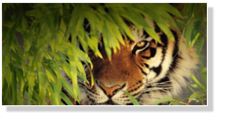
Source Code
<!Doctype>
<html>
<head>
  <style>
    .img {
      width: 400px;
      height: 200px;
      border:2px solid #fff;
      background: url(img/tiger.png) no-repeat;
      box-shadow: 10px 10px 5px #ccc;
      -moz-box-shadow: 10px 10px 5px #ccc;
      -webkit-box-shadow: 10px 10px 5px #ccc;
      -khtml-box-shadow: 10px 10px 5px #ccc;
    }
  </style>
</head>
<body>
  <div class="img"></div>
</body>
</html>
Rounded Corner image with CSS Shadow
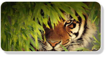
Source Code
.img {
  width: 400px;
  height: 200px;
  border:2px solid #fff;
  background: url(img/tiger.png) no-repeat;
  -moz-box-shadow: 10px 10px 5px #ccc;
  -webkit-box-shadow: 10px 10px 5px #ccc;
  box-shadow: 10px 10px 5px #ccc;
  -moz-border-radius:25px;
  -webkit-border-radius:25px;
  border-radius:25px;
}
Rounded Images with CSS Shadow
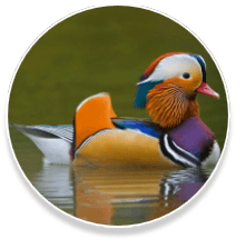
Source Code
.img {
  width: 190px;
  height: 190px;
  border:2px solid #fff;
  background: url(img/duck.png) no-repeat;
  -moz-box-shadow: 0px 6px 5px #ccc;
  -webkit-box-shadow: 0px 6px 5px #ccc;
  box-shadow: 0px 6px 5px #ccc;
  -moz-border-radius:190px;
  -webkit-border-radius:190px;
  border-radius:190px;
}
Images with inset CSS Shadow
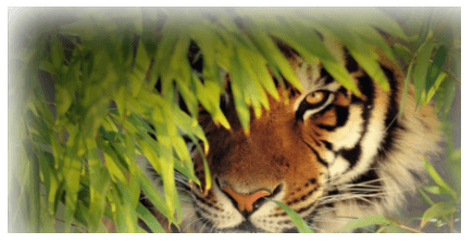
Source Code
.img {
  width: 400px;
  height: 200px;
  border:2px solid #fff;
  background: url(img/tiger.png) no-repeat;
  -moz-box-shadow: inset 10px 10px 50px #fff;
  -webkit-box-shadow: inset 10px 10px 50px #fff;
  box-shadow: inset 10px 10px 50px #fff;
}
Image behind text
You can write text on top of the mages in CSS.
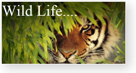
Source Code
<!Doctype>
<html>
<head>
  <style>
    .img {
      width: 400px;
      height: 200px;
      border:2px solid #fff;
      background: url(img/tiger.png) no-repeat;
      color:white;
      font-size:50px;
      -moz-box-shadow: 10px 10px 50px #ccc;
      -webkit-box-shadow: 10px 10px 50px #ccc;
      box-shadow: 10px 10px 50px #ccc;
    }
  </style>
</head>
<body>
  <div class="img">Wild Life....</div>
</body>
</html>
Shaped Image with CSS Shadow
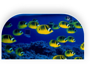
Source Code
.img {
  width: 270px;
  height: 150px;
  border:2px solid #fff;
  background: url(img/fish.png) no-repeat;
  box-shadow: 0px -10px 30px #ccc;
  color:white;
  font-size:50px;
  border-top-left-radius:75px;
  border-top-right-radius:75px;
  border-bottom-left-radius:0px;
  border-bottom-right-radius:0px;
}
Conclusion
Utilizing image shadow CSS effectively can elevate the user experience on your website by adding depth, emphasis, and visual appeal. Whether you’re building a portfolio, e-commerce site, or any other web project, mastering the nuances of CSS for shadows will enable you to create more polished and visually engaging designs. Experiment with different shadow effects and see how they can enhance your web pages.
FAQ
Yes, the color of the shadow can be any CSS color value, allowing for creative shadow effects.
Shadows can be resource-intensive if overused or applied with a very large blur radius. It’s important to balance aesthetics with performance.
Using RGBA for shadow colors can help make shadows more versatile against different backgrounds, as the transparency can blend the shadow smoothly.
Yes, CSS animations can be applied to box-shadow properties to create dynamic effects, especially useful for interactive elements like buttons and links.