In the realm of web design, the allure of CSS image hover effects cannot be overstated. These effects add an element of interactivity and sophistication to your website, captivating users with visual transitions that engage and impress. This article delves into various types of hover effect on image implementations using CSS, providing practical tips and code examples to enhance your web projects.
Understanding CSS Image Hover Effects
CSS (Cascading Style Sheets) provides a versatile toolkit for designers to enhance user experience through interactive and visually appealing effects, all without the need for heavy scripts or external plugins. Central to these effects is the :hover pseudo-class, which enables the definition of different states for an element when the mouse hovers over it. Below are some of the key CSS properties commonly used to create captivating image hover effects:
Opacity
This property controls the transparency of an element, allowing you to fade it in or out smoothly upon hover. It accepts values from 0 to 1, where 0 is fully transparent and 1 is fully opaque. Here’s a basic example:
.image-container:hover {
opacity: 0.7;
}
This will make the image within the .image-container slightly transparent when hovered over.
Transform
With the transform property, you can apply various transformations to an element, such as scaling, rotating, and translating (moving). This can create visually engaging effects when combined with hover interactions. For instance:
.image-container:hover img {
transform: scale(1.1);
}
This CSS rule enlarges the image within .image-container by 10% when hovered over.
Filter
The filter property applies visual effects like blur, grayscale, or sepia to an element. By altering these effects upon hover, you can add depth and intrigue to your images. Example usage:
.image-container:hover img {
filter: grayscale(100%);
}
This CSS snippet converts the image to grayscale when hovered over, providing a distinct visual change.
Transition
To control the smoothness and timing of CSS animations, the transition property is invaluable. It defines how CSS properties change over time, allowing for seamless transitions between different states. Here’s a generic example:
.image-container img {
transition: transform 0.3s ease;
}
This CSS rule specifies that any transformation applied to the image within .image-container should occur over a duration of 0.3 seconds with an easing effect for smoothness.
Advanced Techniques
In addition to the basic properties outlined above, advanced techniques can further enhance the visual impact of image hover effects. These include:
- Box Shadow: Adding a subtle shadow effect to images can create depth and realism. By adjusting the shadow properties upon hover, you can create dynamic lighting effects. Example:
.image-container img {
box-shadow: 0 0 10px rgba(0, 0, 0, 0.5);
transition: box-shadow 0.3s ease;
}

.image-container:hover img {
box-shadow: 0 0 20px rgba(0, 0, 0, 0.7);
}- Overlay Effects: Overlaying a semi-transparent color layer on images can add emphasis and focus. By adjusting the overlay color or opacity upon hover, you can create subtle or dramatic effects. Example:
.image-container {
position: relative;
}

.image-container::after {
content: "";
position: absolute;
top: 0;
left: 0;
width: 100%;
height: 100%;
background-color: rgba(0, 0, 0, 0.3);
opacity: 0;
transition: opacity 0.3s ease;
}

.image-container:hover::after {
opacity: 1;
}
Implementing Basic Hover Effects
Let’s start with some basic but impactful hover effects that can be easily integrated into any website.
Fade Effect
One of the simplest yet visually pleasing hover effects is the fade effect. It gradually alters the opacity of the image, creating a smooth transition that appears as if the image is fading in or out upon hovering.
.img-fade {
opacity: 1;
transition: opacity 0.5s ease-in-out;
}

.img-fade:hover {
opacity: 0.5;
}- img-fade: This class represents the image to which the fade effect will be applied;
- opacity: The opacity property controls the transparency of the image. A value of 1 represents full opacity, while 0 represents complete transparency;
- transition: This property specifies the transition effect and its duration. In this case, the opacity transition occurs over 0.5 seconds with an ease-in-out timing function;
- :hover: The pseudo-class selector targets the element when it’s hovered over, triggering the opacity change.
Scale Effect
Another classic hover effect is the scale effect, which creates a zoom-in effect on the image when hovered over.
.img-scale {
transform: scale(1);
transition: transform 0.5s ease;
}

.img-scale:hover {
transform: scale(1.1);
}- img-scale: This class is assigned to the image to enable the scale effect;
- transform: The transform property applies scaling transformations to the element. A scale value of 1 represents the original size, and values greater than 1 enlarge the element;
- transition: Similar to the previous example, this property specifies the transition effect and duration. Here, the scaling transition occurs over 0.5 seconds with an ease timing function.
Extending Hover Effects
While the above examples provide a solid foundation, there are numerous ways to further enhance hover effects and customize them to suit specific design requirements.
- Adding Multiple Effects: Combine multiple hover effects to create more dynamic interactions. For instance, you can combine the fade effect with the scale effect to create a fade-in zoom effect;
- Experimenting with Timing and Easing Functions: Adjust the duration and timing functions of transitions to achieve different visual effects. Experiment with easing functions such as ease-in, ease-out, or cubic-bezier for unique transition behaviors;
- Incorporating Additional Properties: Explore other CSS properties such as box-shadow, border-radius, or background-color to add depth and texture to hover effects;
- Utilizing CSS Grid and Flexbox: Take advantage of CSS layout techniques like grid and flexbox to create more complex hover effects with precise positioning and alignment.
Advanced Techniques in Hover Effects

For those looking to push the boundaries, advanced techniques offer more intricate interactions.
Rotate and Zoom
This technique combines rotation and scaling to produce a dynamic effect that adds flair to image hover interactions.
.img-rotate-zoom {
transform: rotate(0deg) scale(1);
transition: transform 0.5s ease-in-out;
}

.img-rotate-zoom:hover {
transform: rotate(360deg) scale(1.2);
}- img-rotate-zoom: This class applies the rotate and zoom effect to the image;
- transform: The transform property enables the rotation and scaling transformations. The initial state sets the rotation to 0 degrees and the scale to 1;
- transition: This property defines the transition effect and its duration. The transform transition occurs over 0.5 seconds with an ease-in-out timing function;
- :hover: The pseudo-class selector targets the element when it’s hovered over, triggering the rotation and scaling transformations.
Blur Effect
Blurring an image on hover is an effective technique to draw attention to accompanying text or another element while adding a touch of elegance to the design.
.img-blur {
filter: blur(0px);
transition: filter 0.5s ease-in-out;
}

.img-blur:hover {
filter: blur(8px);
}- img-blur: This class applies the blur effect to the image;
- filter: The filter property applies visual effects to the element. In this case, the blur function is used to blur the image. The initial state sets the blur radius to 0 pixels;
- transition: Similar to previous examples, this property specifies the transition effect and duration. The blur transition occurs over 0.5 seconds with an ease-in-out timing function.
Extending Advanced Techniques
These examples provide a glimpse into the possibilities of advanced hover effects, but there’s much more to explore and experiment with. Here are some ideas for further customization:
- Combining Effects: Experiment with combining multiple hover effects to create more complex and dynamic interactions. For example, combine the rotate and zoom effect with the blur effect for a mesmerizing transition;
- Fine-tuning Transition Timing: Adjust the duration and timing functions of transitions to achieve precise and polished effects. Consider using cubic-bezier functions for more customized transition behaviors;
- Exploring Additional Properties: Dive deeper into CSS properties beyond transform and filter, such as box-shadow, opacity, or background-color, to create even more diverse hover effects;
- Animating with Keyframes: Explore CSS keyframe animations to create intricate and choreographed hover effects that go beyond simple transitions.
Creatively Combining Effects
Mixing multiple effects can lead to unique and imaginative hover interactions that add complexity and style to your website or application. Let’s explore how you can creatively combine the above effects to achieve compelling results.
Fade and Scale
This effect combines the fade and scale effects to create an intriguing interaction where the image both zooms in and becomes semi-transparent upon hovering.
.img-fade-scale {
opacity: 1;
transform: scale(1);
transition: opacity 0.5s ease, transform 0.5s ease;
}

.img-fade-scale:hover {
opacity: 0.6;
transform: scale(1.1);
}- img-fade-scale: This class applies the fade and scale effect to the image;
- opacity: The opacity property controls the transparency of the image. The initial state sets the opacity to 1, making the image fully opaque;
- transform: The transform property applies scaling transformations to the image. The initial state sets the scale to 1, representing the original size of the image;
- transition: This property specifies multiple transition effects and their durations. Both opacity and transform transitions occur over 0.5 seconds with an ease timing function;
- :hover: The pseudo-class selector targets the element when it’s hovered over, triggering the opacity and scale changes.
Exploring Further Combinations
The possibilities for combining hover effects are endless. Here are some additional ideas to explore:
- Fade and Rotate: Combine the fade effect with the rotation effect to create a mesmerizing transition where the image both fades out and rotates upon hovering;
- Scale and Blur: Experiment with combining the scale effect with the blur effect to create a dynamic interaction where the image both zooms in and blurs upon hovering, drawing attention to specific details;
- Opacity and Color Change: Mix the opacity effect with a color change effect to create a captivating interaction where the image becomes semi-transparent and changes color simultaneously upon hovering.
Customization and Experimentation
Don’t be afraid to customize and experiment with different combinations of hover effects to achieve the desired aesthetic and user experience. Consider adjusting the timing and easing functions of transitions, as well as exploring additional CSS properties and techniques to further enhance your hover interactions.
Best Practices For Hover Effect On Image In Css
When designing websites, incorporating hover effects on images can add interactivity and visual appeal. However, it’s essential to implement these effects thoughtfully to ensure they enhance the user experience rather than hinder it. Here are some best practices to consider when using CSS for image hover effects:
Keep it Simple
One of the cardinal rules of designing hover effects is to keep them simple. Overly complex effects can overwhelm users and distract them from the content or functionality of the website. Simple hover effects are more elegant and intuitive, contributing to a better overall user experience. Here is an example of a straightforward hover effect:
.image-container:hover img {
opacity: 0.7;
transition: opacity 0.3s ease;
}
This CSS code snippet demonstrates a straightforward hover effect where the opacity of the image decreases when hovered over, creating a subtle visual change.
Test Across Browsers
Browser compatibility is crucial for ensuring that your hover effects work seamlessly across different web browsers, including Google Chrome, Mozilla Firefox, Safari, and Microsoft Edge. Before deploying your website, thoroughly test your hover effects on various browsers and devices to identify any inconsistencies or issues. Here are examples of browser compatibility testing:
- Google Chrome;
- Mozilla Firefox;
- Safari;
- Microsoft Edge;
- Internet Explorer (if necessary).
Tools like BrowserStack or CrossBrowserTesting can help automate the process of testing your website across multiple browsers.
Enhance Usability
Hover effects should serve a functional purpose, such as providing additional information or feedback, rather than being purely decorative. Consider how hover effects can improve usability and make interactions more intuitive for users. Here are some examples of hover effects that improve usability:
- Displaying captions or tooltips when hovering over images with relevant information;
- Highlighting clickable areas to indicate interactive elements, such as buttons or links;
- Providing visual feedback, such as changing the cursor style or adding subtle animations, to indicate hoverable elements.
By focusing on usability, you can ensure that your hover effects contribute positively to the overall user experience of your website.
CSS image hover effects
CSS hover effects gives us the ability to animate changes to a CSS property value. In the following lesson we are going to follow that up with different kinds of effects specifically built for use with images. However, these effects can make your site feel much more dynamic and alive. The effects we will be using today all use code that is supported by modern browsers.
Create A Rollover Image Effect (Hover Effects)
The following code shows how to show a hover effect on Box Shadow.
Mouse over here
Source Code
<!DOCTYPE html>
<html >
<head>
  <style type="text/css">
    .box
    {
      width: 150px;
      border: 1px solid #9325BC;
      padding: 10px;
    }
    .box:hover
    {
      -moz-box-shadow: 0 0 10px #ccc;
      -webkit-box-shadow: 0 0 10px #ccc;
      box-shadow: 0 0 10px #ccc;
    }
  </style>
</head>
<body>
  <div class="box">
  Move your mouse here
  </div>
</body>
</html>
Image Hover Effects (Image Rollovers)
The following CSS code shows how to present an Image hover effects.
Move your mouse over the Image.
Source Code
More about CSS Shadow….CSS Shadow Examples
<!DOCTYPE html>
<html >
<head>
<style type="text/css">
.imgBox
{
width: 441px;
height: 248px;
background: url(http://www.corelangs.com/css/box/img/water.jpg) no-repeat;
}
.imgBox:hover
{
-moz-box-shadow: 0 0 10px #ccc;
-webkit-box-shadow: 0 0 10px #ccc;
box-shadow: 0 0 10px #ccc;
}
</style>
</head>
<body>
<div class="imgBox">
</div>
</body>
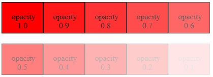
</html>CSS Image Opacity / Transparency
Opacity is the opposite of transparency, allowing no light to pass through. You can create transparent images in CSS with the opacity property .
CSS Image fade effect
Image Blur effect
img
{
     opacity: 0.3;
}
More about …. How to Transparent Background Images
Creating transparent/Opacity images – mouseover effect
The following CSS program shows how to impliment Opacity on an Image while mouse hover. When you mouse over the image, you can see the image is fading.
Image Opacity on Hover
Move your mouse over the Image.
Source Code
<!DOCTYPE html>
<html >
<head>
  <style type="text/css">
    .pic{
      width:190px;
      height:190px;
      opacity: 1;
      filter: alpha(opacity=100);
      background: url(http://www.corelangs.com/css/box/img/duck.png) no-repeat;
    }
    .pic:hover
    {
      opacity: 0.3;
      filter: alpha(opacity=30);
    }
  </style>
</head>
<body>
  <div class="pic">
  </div>
</body>
</html>
Text Overlay on Image Hover
Layering images over one another is a great way to give an Image a new Look. Here, the CSS code that display text on image while mouse hover
Move your mouse over the Image.
The tiger is the largest cat species, reaching a total body length of up to 3.3 m and weighing up to 306 kg. Its most recognizable feature is a pattern of dark vertical stripes on reddish-orange fur with a lighter underside.
Source Code
More about CSS Overlay….CSS Overlay Techniques
<!DOCTYPE html>
<html >
<head>
  <style type="text/css">
    .pic{
      width:400px;
      height:217px;
      background: url(http://www.corelangs.com/css/box/img/tiger.png) no-repeat;
    }
    .text{
      width:340px;
      height:217px;
      background:#FFF;
      opacity:0;
    }
    .pic:hover .text
    {
      opacity:0.6;
      text-align:justify;
      color:#000000;
      font-size:20px;
      font-weight:700;
      font-family:"Times New Roman", Times, serif;
      padding:30px;
    }
  </style>
</head>
<body>
  <div class="pic">
  <div class="text">
  The tiger is the largest cat species, reaching a
  total body length of up to 3.3 m and weighing up
  to 306 kg. Its most recognizable feature is a pattern
  of dark vertical stripes on reddish-orange fur
  with a lighter underside.
  </div>
</div>
</body>
</html>
CSS hover image swap – onmouseover Event
The following CSS code shows how to change an Image on mouse over. On mouse hover one div containging image is placed over the other image.
Move your mouse over the Image.
Source Code
How to Full Page Overlay Window….CSS Fullscreen overlay
<!DOCTYPE html>
<html >
<head>
  <style type="text/css">
    .imgBox
    {
      width: 191px;
      height: 191px;
      background: url(http://www.corelangs.com/css/box/img/duck.png) no-repeat;
    }
    .imgBox:hover {
      width: 191px;
      height: 191px;
      background: url(http://www.corelangs.com/css/box/img/peng.png) no-repeat;
    }
  </style>
</head>
<body>
  <div class="imgBox">
  </div>
</body>
</html>
Image link change on hover (Make A Rollover Image Effect)
The following source code shows how to change the image link while on mouse hover.
Move your mouse over the Image Link.
Source Code
<!DOCTYPE html>
<html >
<head>
  <style type="text/css">
    .urlImg {
      width: 185px;
      height:185px;
      display:block;
      background-image: url('img/duck.png');
    }
    .urlImg:hover {
      background-image: url('img/peng.png');
    }
  </style>
</head>
<body>
  <a href="http://www.corelangs.com" class="urlImg" title="Corelangs link"></a>
</body>
</html>
CSS Div Hover
You can change the background color of a Div on Hover. The following CSS code shows how to change div background color on hover.
Move your mouse over the Div.
CSS Div hover effects
Source Code
<!DOCTYPE html>
<html >
<head>
  <style type="text/css">
    .picColor{
      width:320px;
      height:240px;
      border:5px solid #000000;
    }
    .picColor:hover
    {
      background:#FF2400;
      width:320px;
      height:240px;
    }
  </style>
</head>
<body>
  <div class="picColor">
  </div>
</body>
</html>
Conclusion
By mastering CSS and its capabilities for image hover effects, you can significantly boost the visual appeal and interactivity of your website. Whether you opt for subtle transitions or complex animations, the key is to integrate effects that complement your site’s overall design and user experience. Remember, a well-implemented hover effect can make your site not just seen, but experienced.
FAQ
Yes, hover effects can be applied to CSS background images using the background-size property combined with transitions.
Hover effects are primarily designed for devices with a mouse. For touch devices, consider alternative interactive elements as hover isn’t always accessible.
Ensure that your hover effects do not convey important information that isn’t available by other means. Always provide textual alternatives where necessary.
CSS transitions are generally hardware-accelerated and do not significantly impact performance. However, complex animations on large images can slow down your site on less powerful devices.